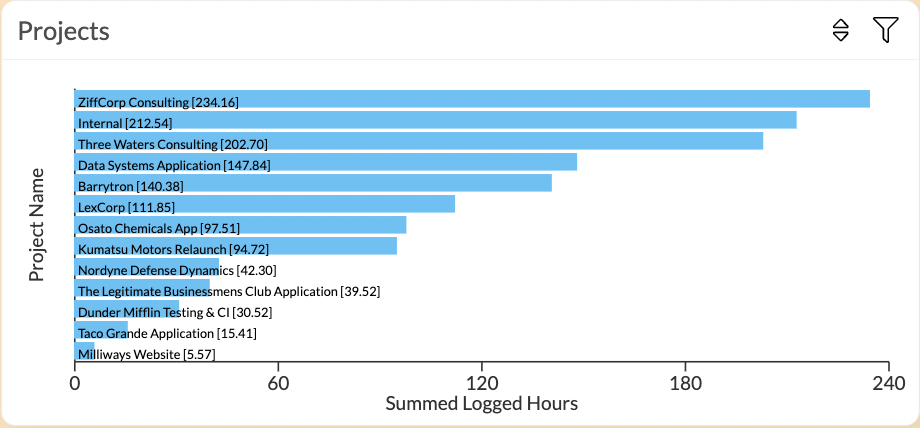
Row Chart
Overview
The row chart - one of the most commonly used chart types - can be used in a variety of analyses to visualise data in a simple and yet highly effective way. Therefore, in Exply, the row chart, just like the bar chart, is one of the most powerful chart types with a wide range of data and display options.
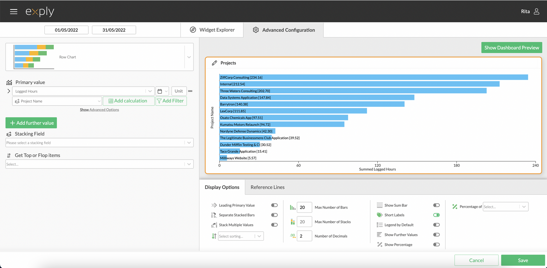
Row Chart Advanced Configuration Screen
Options
Every widget comes with a different set of options. All available options are described in the following passage.
Data Options
Bar and Row charts are very versatile in displaying a wide variety of data and visualisations. Here is what you need to know.
Row Chart Data Options Overview
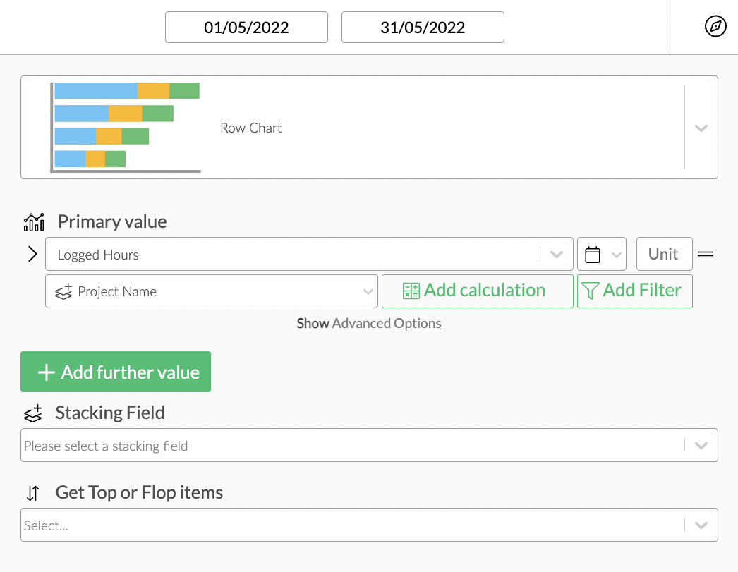
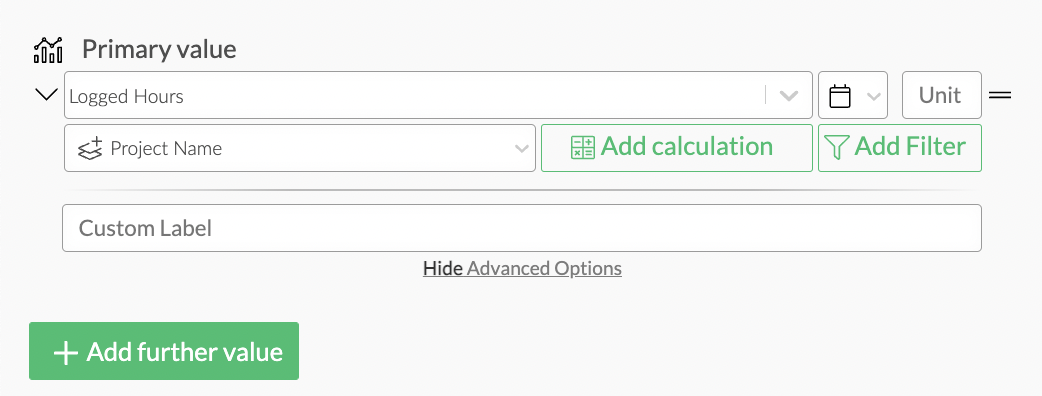
Values
From top to bottom, the left side of a widget always starts with the value.
Row Chart Configuration
Value Filters
Filters are a very powerful way to narrow your visualisations down to a specific focus.
Part of the whole filter feature is the possibility to add filters at value-level within widgets.
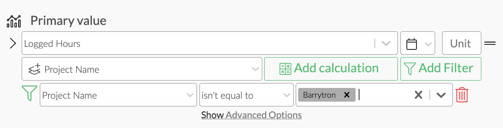
Value filter
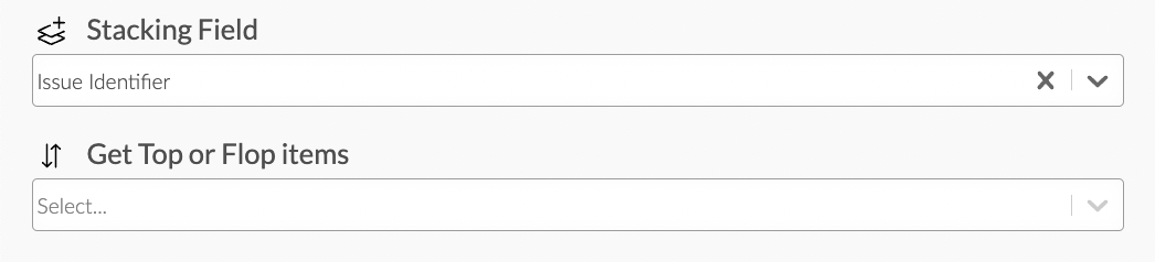
Stacking & Pivot
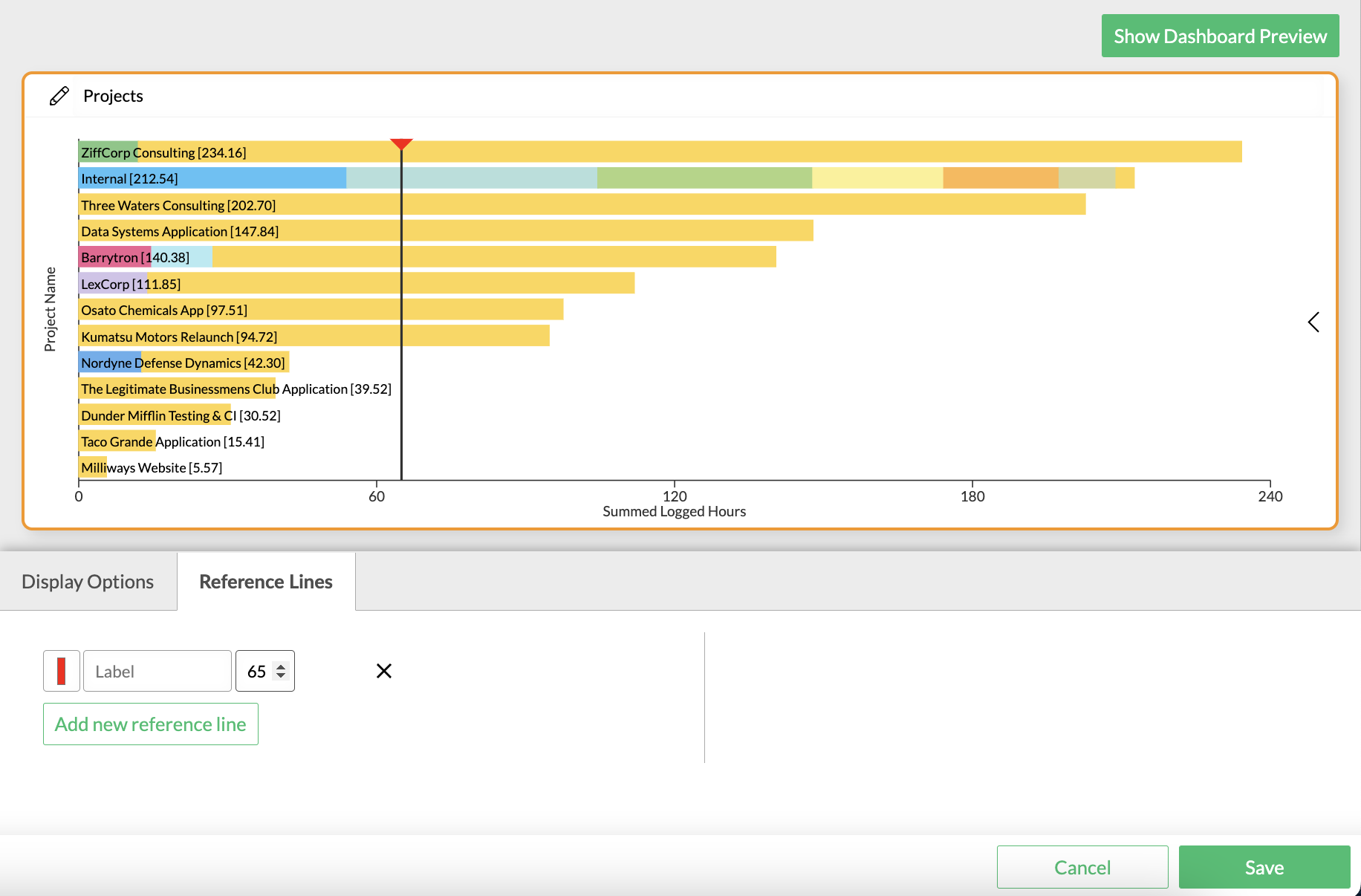
The Stacking Field option allows you to pivot your data by a second dimension. Here is an example:
Row Chart Pivot and Stacking Fields Configuration
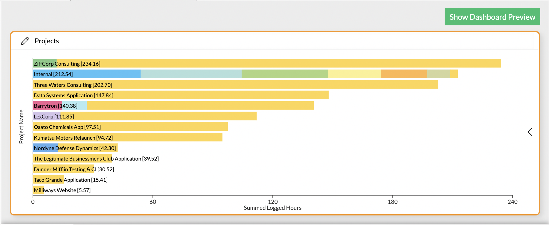
Logged Hours per Project Row Chart Stacked by Issue Identifier
Top & Flop Items
If you limit the number of bars or stacks in your chart to less than the amount of bars or stacks that would technically exist in your data, you can select whether you'd like to see the top or the flop items of your data set.
Row Chart
Display Options
Display options are used to modify the appearance of a widget. The following options are available:
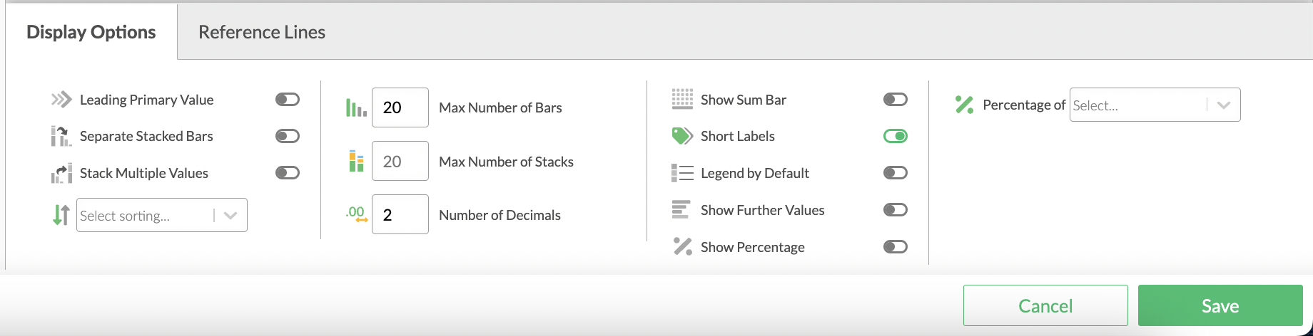
Row Chart Display Options
Leading Primary Value
By enabling he Leading Primary Value option the Bar Chart will only show secondary values where the primary value has data.
For example, you want to compare the Tempo Workload Hours of certain team members with the sum of estimates of the issues they are assigned to. The 1st Value Field would be Workload Hours of Team Members of a certain team and the 2nd Value Field would be Original Estimate - with the new option only the filtered team members will be populated with the estimated hours as a second value.
By default this option is deactivated.
Cluster Values
Enabling this option will show the selected category stacking field as separate bars, instead of stacked bars.
By default this option is deactivated.
Value Sorting
Per default values are sorted by value in descending order. The following sorting options are available:
- Value descending
- Value ascending
- Name descending
- Name ascending
Max Number of Rows
... defines the maximum number of shown bars within the widget. Per default this is set to 12.
Max Number of Stacks
... defines the maximum number of stacks shown in the widget. Per default this is set to 12.
Number of Decimals
... defines the number of decimal places after the decimal point. Per default this is set to 2.
Show Sum Bar
This option adds an additional bar which shows the sum of all values to the end of the widget. Per default this option is deactivated.
Short Labels
This option shortens the value labels shown in the on-hover-legend. For example:
Long Label Example: Total Sale in Dollars of SCOTT: 14.000.625,00$
Short Label Example: SCOTT: 14.000.625,00$
Per default this option is activated.
Legend by Default
The Legend by Default option will only have an effect when the Stacking Field is used. When activated, a legend is permanently shown on the widgets right side. Per default the legend is deactivated.
Show Further Values
Every time the number of different values is greater than the set maximum number of bars or stacks further values are used. The further values bar summarises all values, that are not represented by a single bar or stack.
For example, if there are values for 15 different companies and the maximum number of bars is set to 12, then the last 3 companies will be summarised in a single further values bar.
If the number of maximum bars is raised to at least 15, the 3 companies will be represented by 3 additional bars and the further values bar will disappear. As a result, all bars will be slightly slimmer as more bars need more space.
The further values bar comes in handy, if there are dozens of values and only the "top 10" are of interest.
Per default is option is activated.
Show Percentage
Activate this option to show percentages per bar.
Per default this option is deactivated.
Percentage of Value/Category
If the previous option is activated you can choose whether to have the percentages calculated based on the values or on the different categories.