Dashboards
Overview
Dashboards provide the main analytics functionality of Exply. All data you import can be analysed in a single Dashboard, if you like.
Dashboards consist of individual widgets, which provide different functionality like charts, filters, time selectors, text boxes, etc. This way you can build your own and completely individual Dashboard. This also allows us to simply add new functionality to the system.
Here is an overview of how Exply Dashboards look:
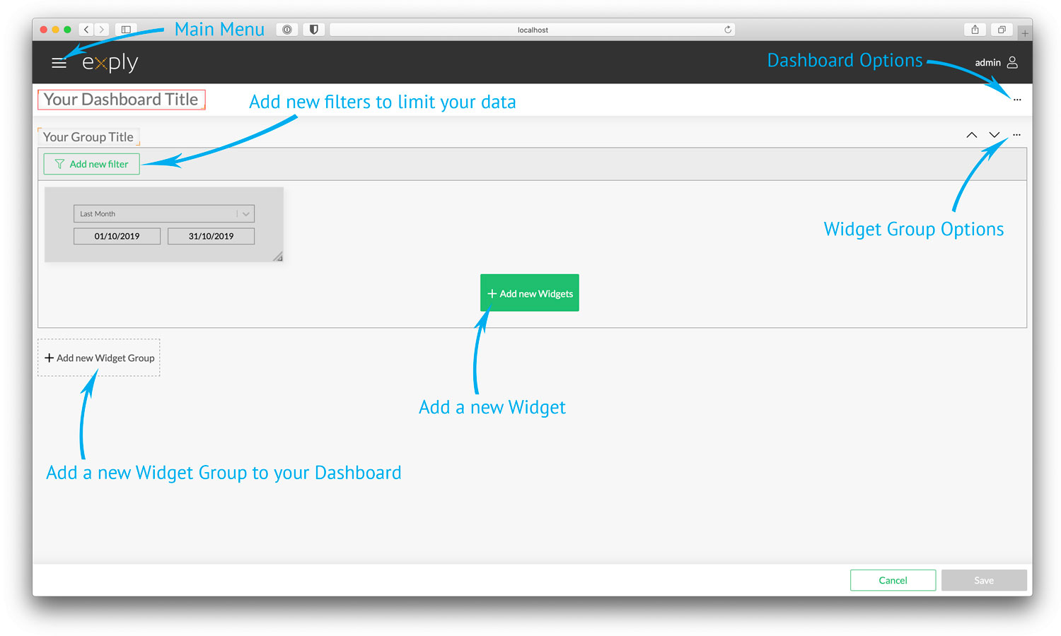
Dashboard Functions Overview
- The Dashboard Overview shows all your exisiting dashboards (as a list or as tiles). The overview allows you to also quickly create a new Dashboard by clicking the plus-symbol in the bottom right corner.
- Giving your dashboard a useful name is essential and best when you choose one that represents the content of the Dashboard. Everyone using it will directly know what he's going to see. Especially when you have a lot of dashboards, this comes in handy.
- For the Widget Group name apply the same rules and principles like for the Dashboard name.
- The Main Menu gives you direct access to all the like Dashboards, Importer Settings, User Management, Documents & Fields Customization, etc.
- You can find the Dashboard options at the top right corner behind the 3-dot menu providing you options to edit, export or delete the Dashboard.
- One of the concepts of Exply are the different levels of filtering the data. Every Dashboard and Widget Group has this option. You can add different data filters to limit the shown data, e.g. by project, team member, etc.
- The Time Selector widget comes automatically with every new Widget Group, to limit the shown data for a certain time span. Notice: Removing the Time Selecter widget maybe results in really long loading times (browser is maybe not responding for a while), especially when absolutely no other filters are applied.
- Widget Group options are available for every Widget Group. They allow you to move them up & down, promote them to a Global Group and duplicate or remove them.
- Widgets represent analysis, e.g. logged hours per project, timeline of created issues, and so on. Build and customize your Dashboards by adding new widgets. You can move and scale Widgets as you like.
- Sometimes you want to compare several projects, teams or different time spans (this vs last month). Widget Groups can help you to easily achieve this by adding a data filter for the first project to the first Widget Group and the second project to the second Widget Group, and so on. Widget Groups are like Dashboards within Dashboards.
- Like explained at number 10
- Save your dashboard to let your changes take effect or cancel all changes to discard them.
First of all - it's useful to set an individual dashboard title, f.e. customer name, project name, team name, etc.
That way you instantly know what the dashboard's content is. Especially when you end up having a lot of them, and you will, that's for sure ;-) Also your customers or project teams will really appreciate the appropriate naming and it makes it way easier to talk about it.
In our example we want to get an overview regarding the project "General Products Website". So we give the dashboard this project name.
The first part of our dashboard shall provide us a quick overview and is named the same way. This also makes it easier for everyone to quickly know what they're looking at.
You'll find the corresponding fields in the upper left corner.