Bar - Time Series Chart
Overview
All time series charts display data with time on the x-axis and your chosen value on the y-axis. In addition you can pivot your data by a second dimension by selecting a stacking field.
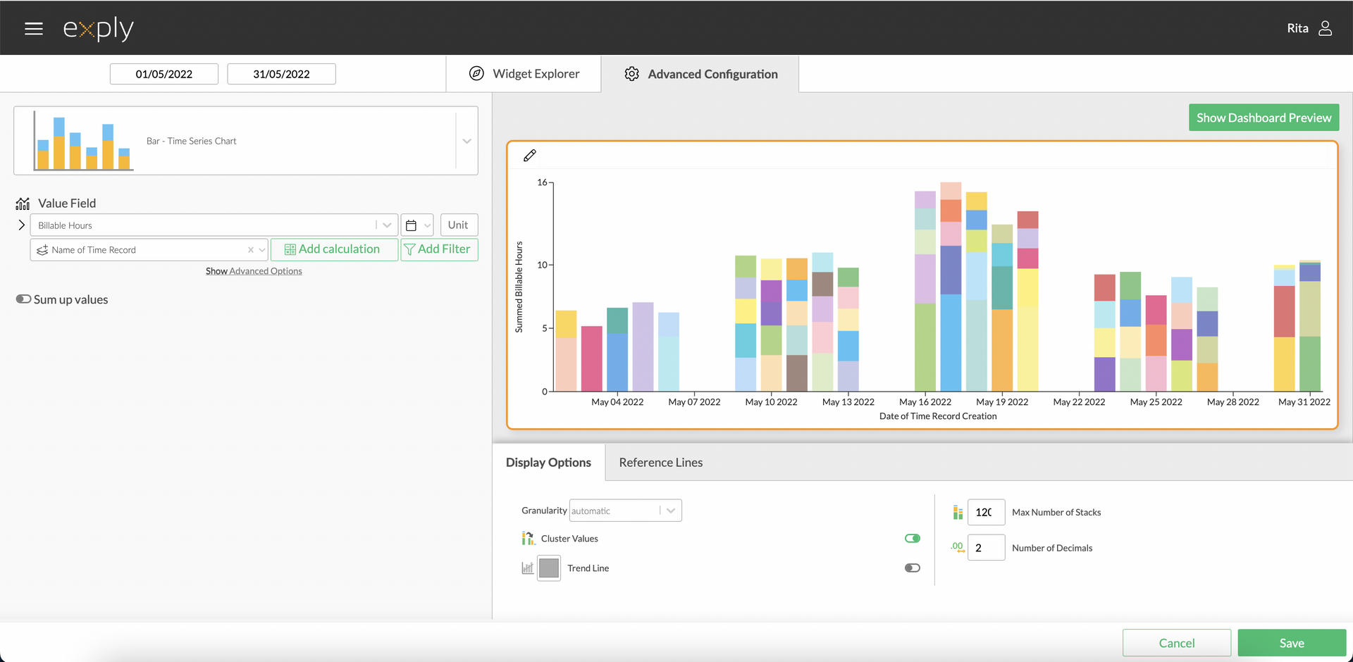
Bar Time Series Chart Advanced Configuration Screen
Options
Every widget comes with a different set of options. All available options are described in the following passage.
Data Options
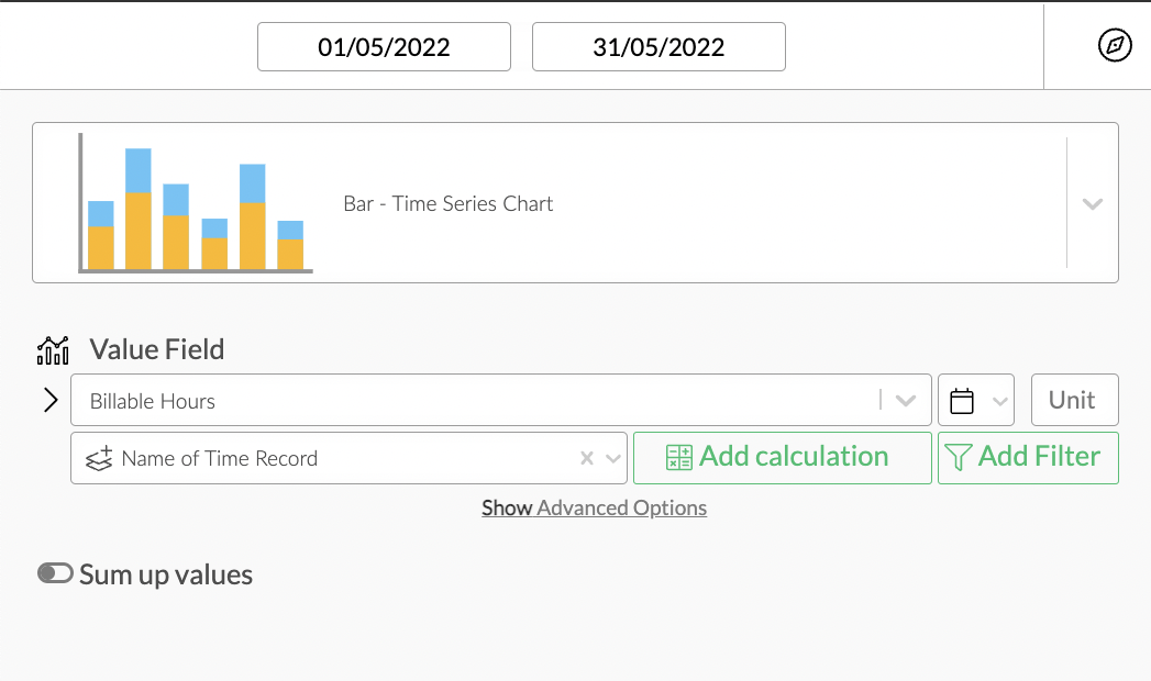
From top to bottom, the left side of a widget always starts with the value field configuration.
In the bar time series chart configuration you can set a value, its date field (calendar icon on the right side next to the value field) and a custom unit.
Below the value field, you can optionally choose a stacking field, which acts as a second pivot field in addition to the timeline.
Bar Time Series Chart Data Options Overview
Sum Up Values
In the chart configuration of the bar time series chart you can switch on "sum up values" to view your data value points not independently from each other but added up over a timespan.
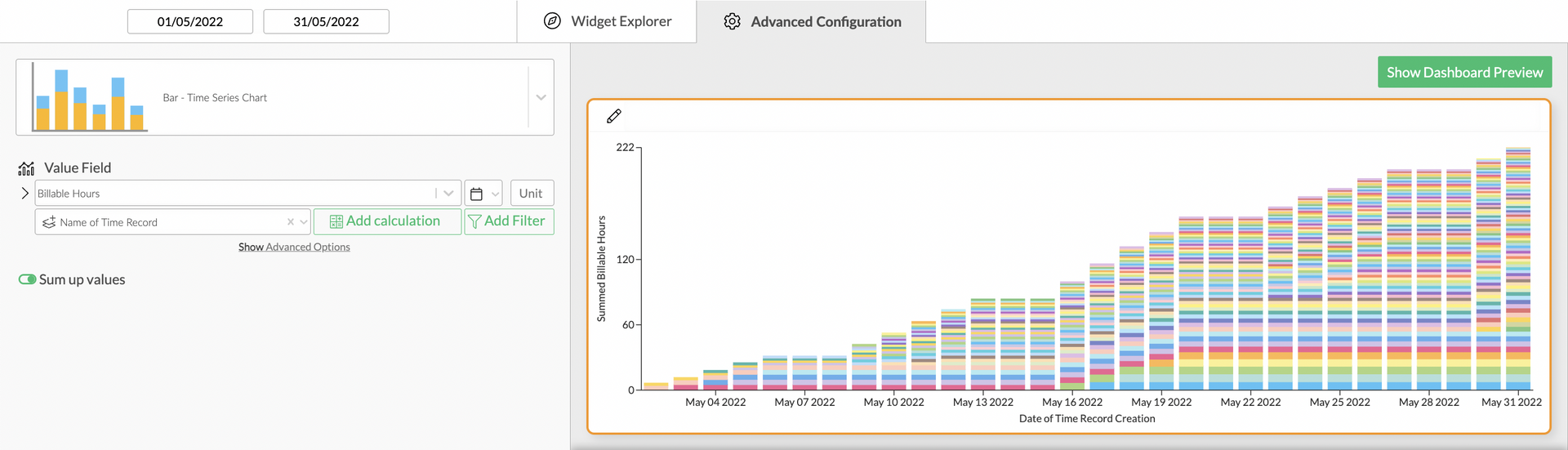
Bar Time Series Chart with Summed Values
Value Filters
As in every other chart, you can apply value filters to your chosen value in the bar time series chart. Find out more about how to configure them in the Filters section!
Calculations
You can add calculations to your value fields. To find out more about how to implement them, check out the Calculations section.
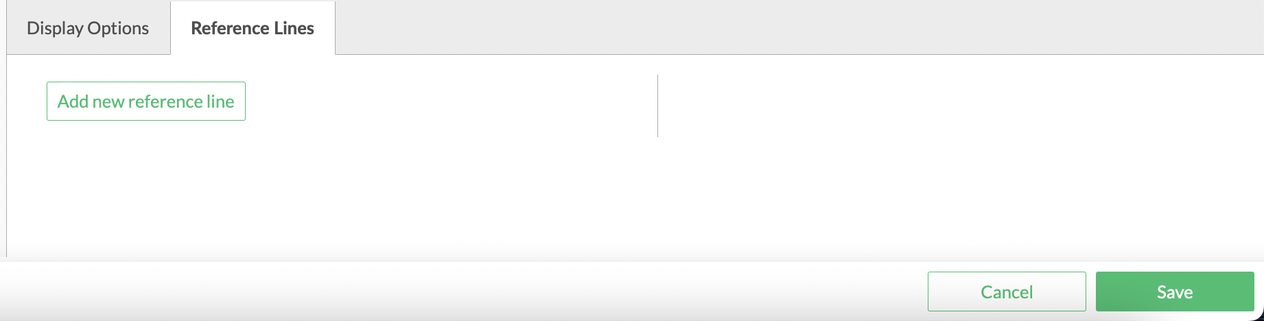
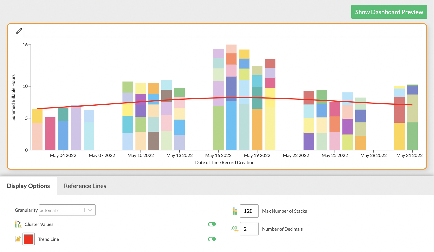
Display Options
Display options are used to modify the appearance of a widget. The following options are available:
You can choose which granularity you'd like your chart to have. In addition to this you can also decide whether you'd like to display the values in clusters, whether missing values should be interpolated and how many stacks you'd like to see. You can also choose which line drawing style you'd prefer and what number of decimals you'd like to be on display.
You'll find more detailed information on the options concerning key value visualisation below.
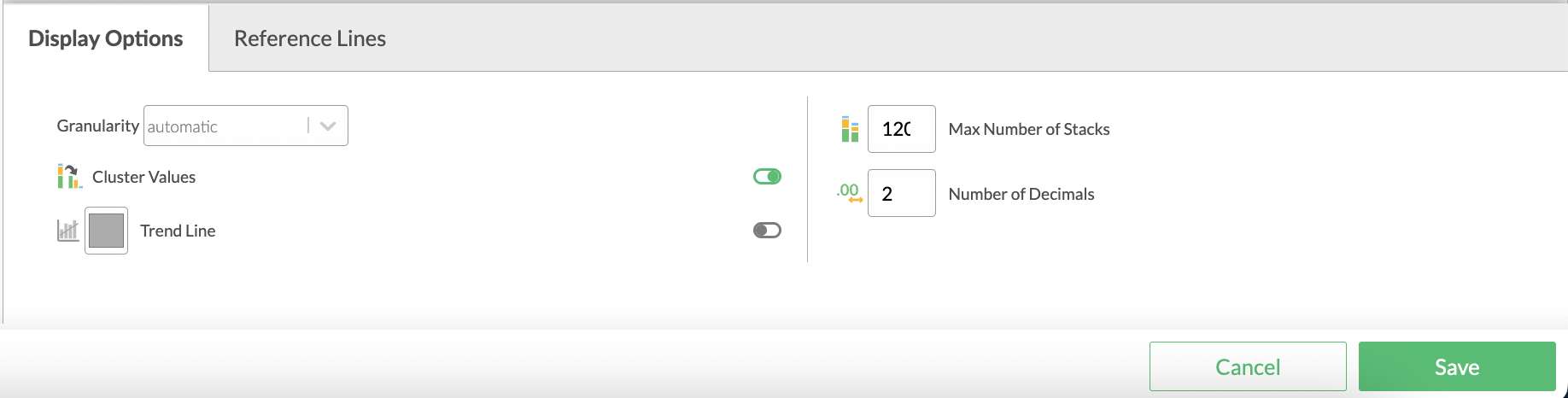
Bar Time Series Chart display options