Map
Overview
If you have location-oriented datasets, the map widget is exactly what you need. Visualised like a scatterplot, you can view your data in different modes on a geographical field.
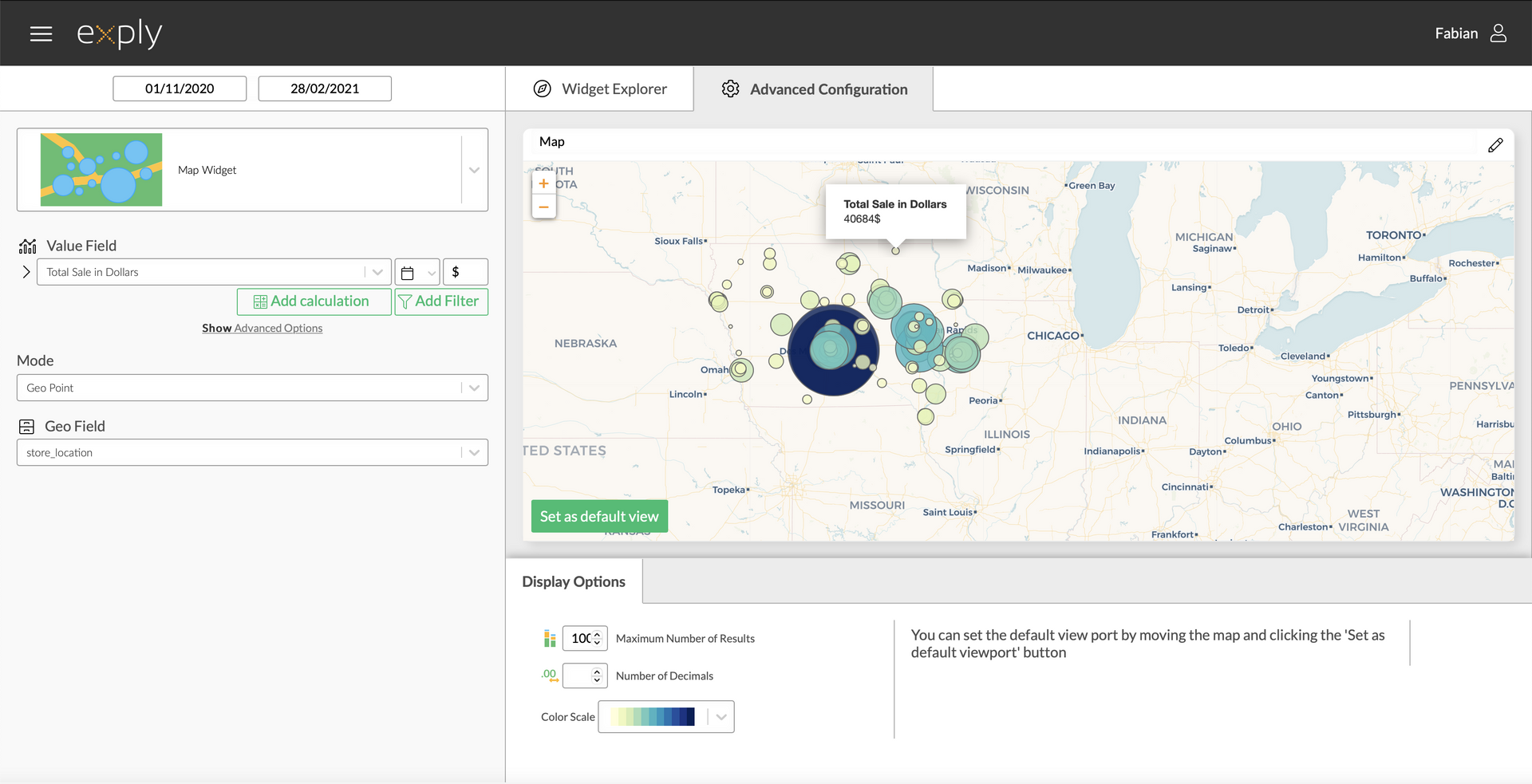
Map Advanced Configuration Screen
Options
Every widget comes with a different set of options. All available options are described in the following passage.
Data Options
Burn Down Chart Data Options Overview
Values
From top to bottom, the left side of a widget always starts with the value.
Multi Value Burn Down Chart Configuration
Display Options
Display options are used to modify the appearance of a widget. The following options are available:
Leading Primary Value
By enabling he Leading Primary Value option the Bar Chart will only show secondary values where the primary value has data.
For example, you want to compare the Tempo Workload Hours of certain team members with the sum of estimates of the issues they are assigned to. The 1st Value Field would be Workload Hours of Team Members of a certain team and the 2nd Value Field would be Original Estimate - with the new option only the filtered team members will be populated with the estimated hours as a second value.
By default this option is deactivated.
Cluster Values
Enabling this option will show the selected category stacking field as separate bars, instead of stacked bars.
By default this option is deactivated.
Value Sorting
Per default values are sorted by value in descending order. The following sorting options are available:
- Value descending
- Value ascending
- Name descending
- Name ascending
Max Number of Bars
... defines the maximum number of shown bars within the widget. Per default this is set to 12.
Max Number of Stacks
... defines the maximum number of stacks shown in the widget. Per default this is set to 12.
Number of Decimals
... defines the number of decimal places after the decimal point. Per default this is set to 2.
Show Sum Bar
This option adds an additional bar which shows the sum of all values to the end of the widget. Per default this option is deactivated.
Short Labels
This option shortens the value labels shown in the on-hover-legend. For example:
Long Label Example: Total Sale in Dollars of SCOTT: 14.000.625,00$
Short Label Example: SCOTT: 14.000.625,00$
Per default this option is activated.
Legend by Default
The Legend by Default option will only have an effect when the Stacking Field is used. When activated, a legend is permanently shown on the widgets right side. Per default the legend is deactivated.
Show Further Values
Every time the number of different values is greater than the set maximum number of bars or stacks further values are used. The further values bar summarises all values, that are not represented by a single bar or stack.
For example, if there are values for 15 different companies and the maximum number of bars is set to 12, then the last 3 companies will be summarised in a single further values bar.
If the number of maximum bars is raised to at least 15, the 3 companies will be represented by 3 additional bars and the further values bar will disappear. As a result, all bars will be slightly slimmer as more bars need more space.
The further values bar comes in handy, if there are dozens of values and only the "top 10" are of interest.
Per default is option is activated.
Show Percentage
Activate this option to show percentages per bar.
Per default this option is deactivated.
Percentage of Value/Category
If the previous option is activated you can choose whether to have the percentages calculated based on the values or on the different categories.