Pivot Table
Overview
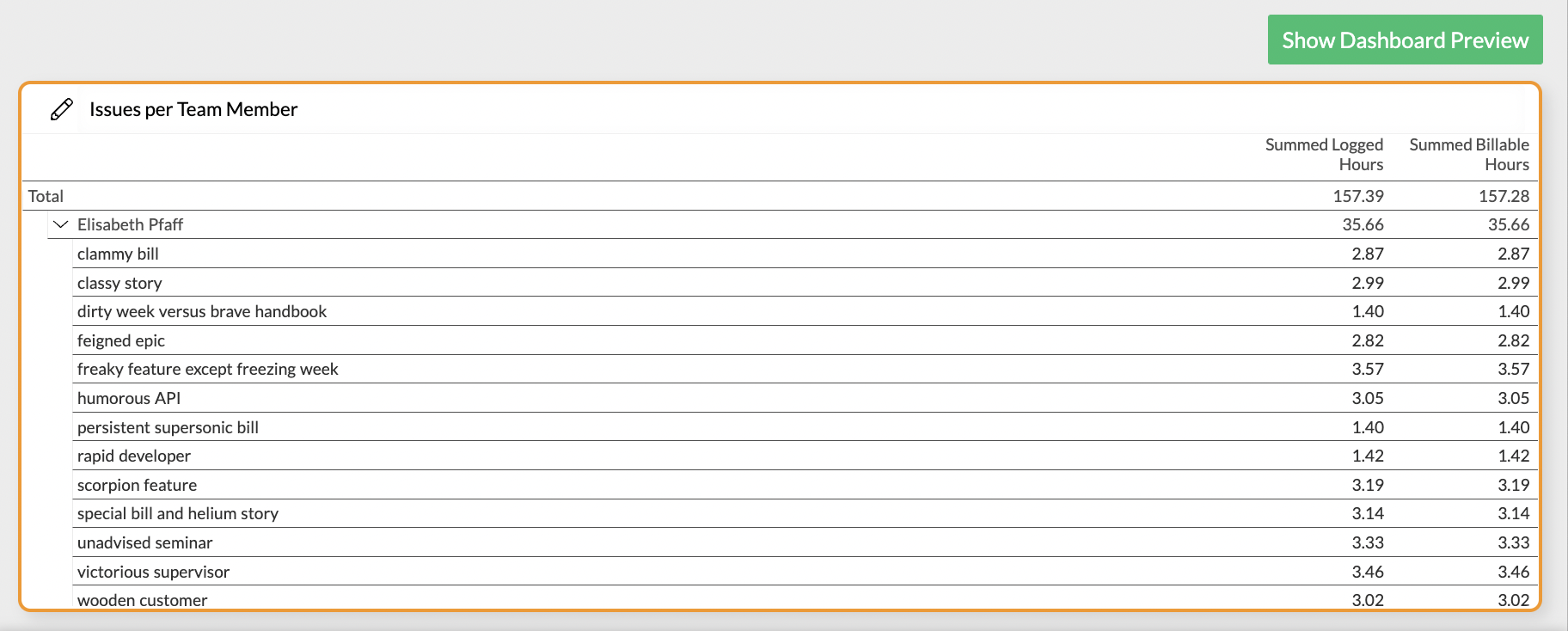
In addition to the raw data table, Exply provides you with the opportunity to analyze your data grouped in categories by using the Pivot Table.

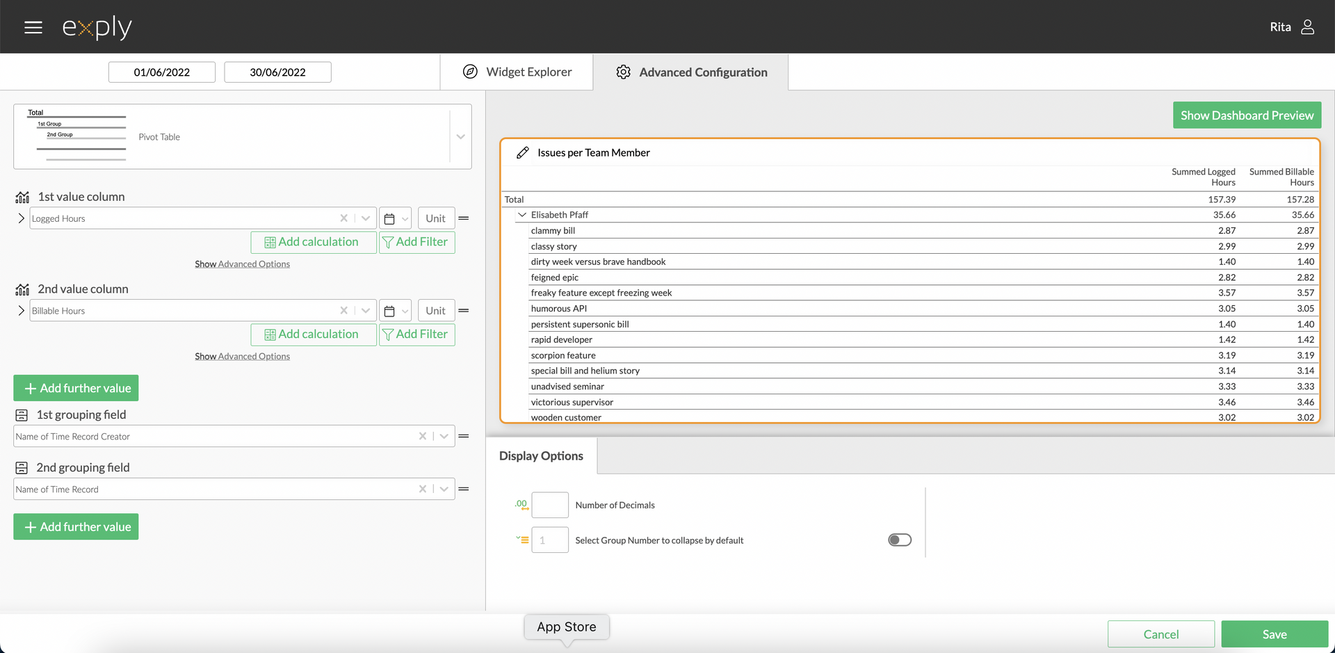
Pivot Table Advanced Configuration Screen
Options
Every widget comes with a different set of options. All available options are described in the following passage. The Pivot table allows you to get an overview of your data sorted by multiple categories.
Data Options

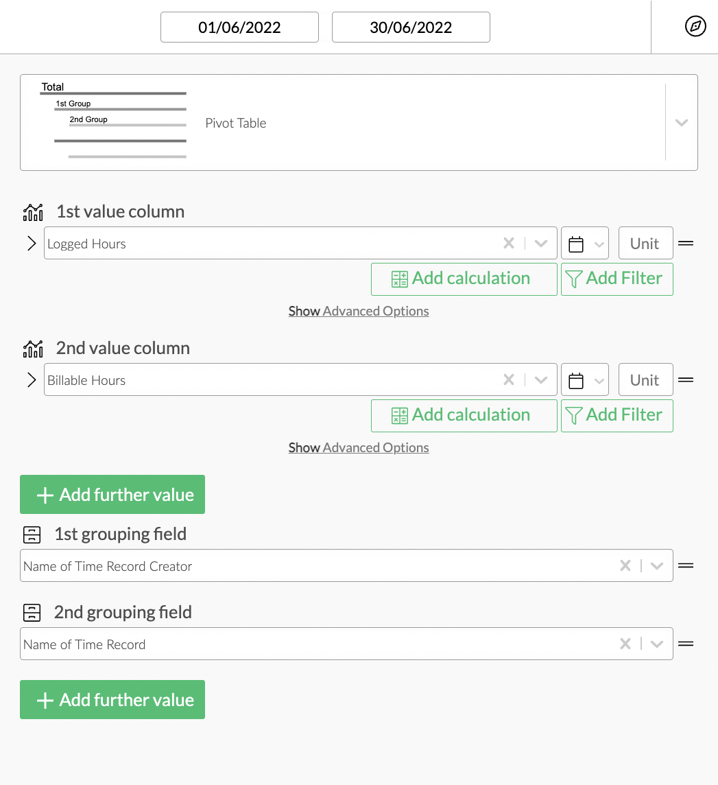
Pivot Table Data Options Overview
Values
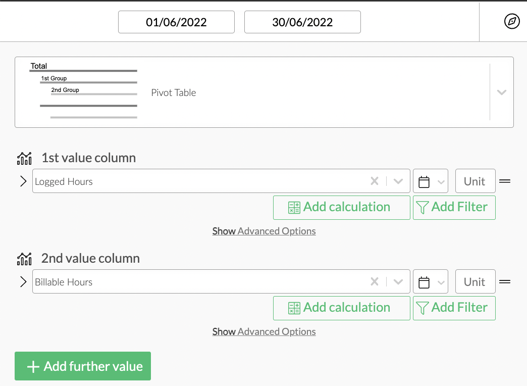
From top to bottom, the left side of a widget always starts with the value configuration. You can select multiple value fields for display in the pivot table. Set a date field or choose "ignore time selection" in the drop-down-menu on the right-hand side of the value field. You can also add a unit to your value for better readability.

Pivot Table Values Configuration
Value Filters
Filters are a very powerful way to narrow your visualisations down to a specific focus.
Part of the whole filter feature is the possibility to add filters at value-level within widgets.
Calculations
You can add calculations to your value fields. To find out more about how to implement them, check out the Calculations section.
Display Options
Display options are used to modify the appearance of a widget. The following options are available:
Number of decimals - you can choose how many decimals are displayed per value on your table.
Select group number to collapse per default - if you've configured a longer pivot table which includes detailed information, but you nevertheless wish to be able to find what you need at a glance, you can choose to collapse the data by groups. For example, using our example from above, we could select group one (team member - "name of time record creator") to be collapsed by default, which would leave us with a list of team member names that we can then expand as needed to view the issues a person booked time on.

Pivot Table Display Options

