Matrix Chart
Overview
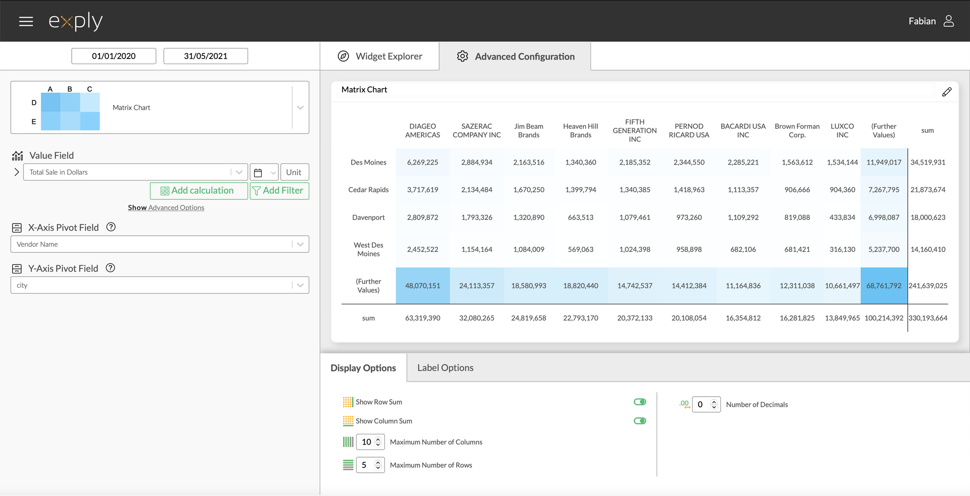
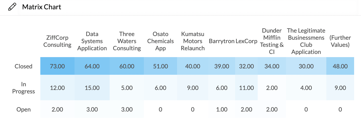
The matrix chart is very useful for an analysis of correlating data sets. In Exply you have the option of choosing a value field for your analysis and pivoting it by two fields.
Matrix Chart Advanced Configuration Screen
Options
Every widget comes with a different set of options. All available options are described in the following passage.
Data Options
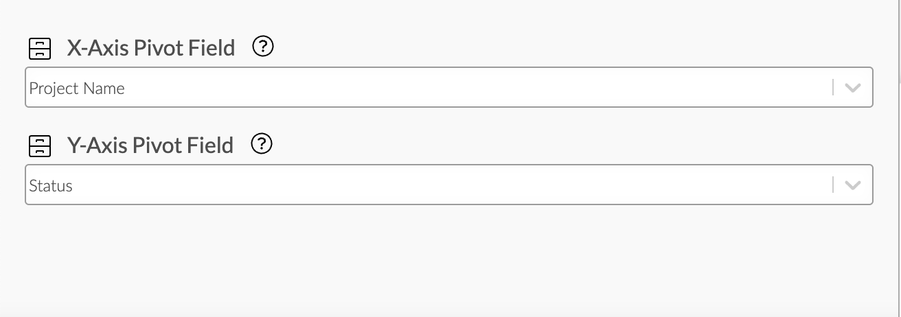
In the following section you'll find everything concerning the data field configuration of the matrix chart.
Values
From top to bottom, the left side of a widget always starts with the value field configuration.
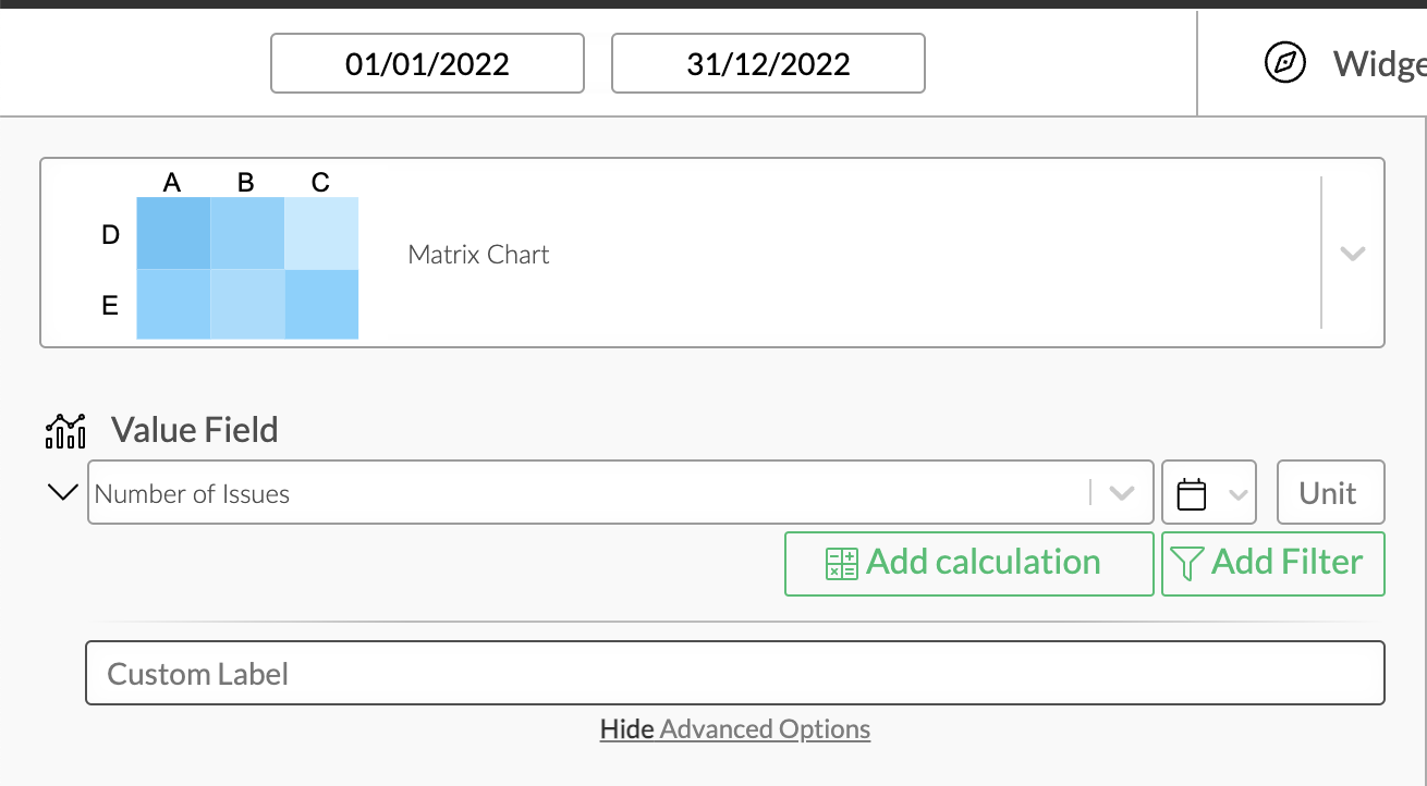
Matrix Chart Value Configuration
Value Filters
As in every other chart, you can apply value filters to your chosen value in the matrix chart. Find out more about how to configure them in the Filters section!
Calculations
You can add calculations to your value fields. To find out more about how to implement them, check out the Calculations section.
Display Options
Display options are used to modify the appearance of a widget. The following options are available:
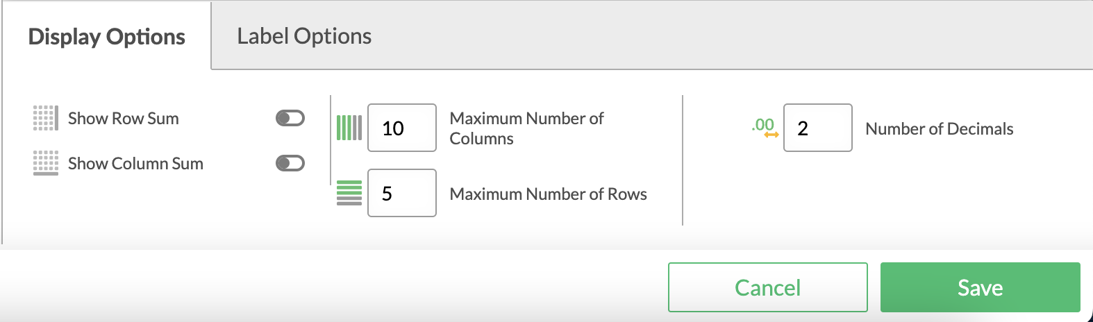
Matrix Options
You can choose whether you'd like the sums of your rows and/or columns to be displayed.
If you only wish to see a certain amount of data, you have the option of limiting the number of columns and/or rows.
Number of Decimals
... defines the number of decimal places after the decimal point. Per default this is set to 2.
Matrix Chart Display Configuration
For a better overview you can customise the axis labels of your matrix.
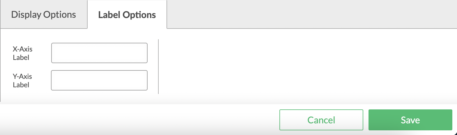
Matrix Chart Label Options